Putting Investing in Perspective
Introducing a powerful way to visualize the likely range of investment returns.
Leonardo Da Vinci said, “Good judgment is born of clear understanding.” So, how is your understanding of investing?
For many people, the process is anything but clear.
Observation
Before we get to investment topics, let’s check out your observation skills.
What do you see in this image? Don’t scroll beyond the image until you take a guess.
If you believe it’s an aerial map, we’ll give you extra points for guessing the city.
Psychologist Samuel Renshaw used this image to explore how we process information, how we can often misinterpret what’s right in front of us, and how different people can look at the same thing and draw different conclusions.
Hint: OK, it’s not an aerial map. It’s an actual photo of an animal.
If you need to, scroll back up and look at the image again.
Once we reveal what the image is, it will likely be one of those, “How did I miss that moments?”
And, of course, props to those of you who saw it immediately.
What is it?
Once we add an outline, you can see it’s a photo of a cow.
This image is known as Renshaw’s Cow.
The Art of Perception
In her Art of Perception course, Amy Herman takes participants to museums to look at art and teaches them to ask questions as a means of honing their observation skills.
Who, for example, is the subject of this painting? What is happening? When is the action taking place? Where is the scene?
For that matter, where’s her other glove?
We highly recommend Amy’s book Visual Intelligence.
When we visit a museum, we tend to go to the paintings that grab our attention, not always the ones we’re supposed to be impressed by. (Though we do like Mona.)
We’ve found Amy’s suggestion of observing the painting first and asking the who, what, when, and where questions before looking at the explanatory placard is both a fun challenge and helps with our appreciation of the painting.
Conflicting Market Observations
So, what about the stock market? Are our observational skills any better there than in the museum?
There are, of course, “expert” opinions—but do they help?
Inevitably, some experts will be bullish on the markets while others are bearish. And these conflicting opinions do little to provide the clear understanding that Da Vinci said leads to good judgments—in our case, smarter investment decisions.
But what if we could look at the markets more objectively?
Visualizing Investing
We can. But instead of a painting, we’ll be looking at an Investment Roulette Wheel.
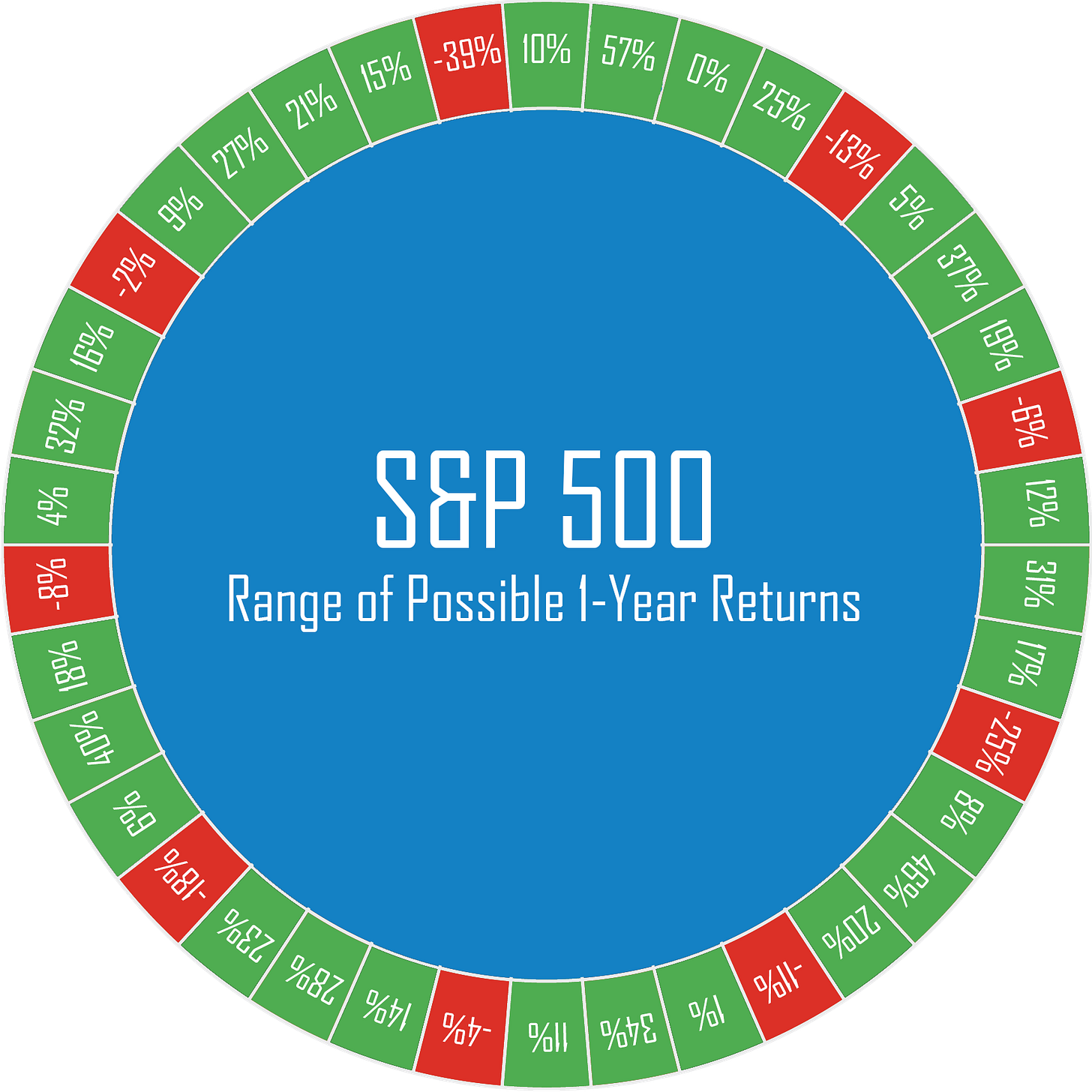
The idea is simple. We can construct “return wheels” from historical data for most investments and time periods.
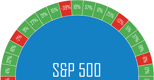
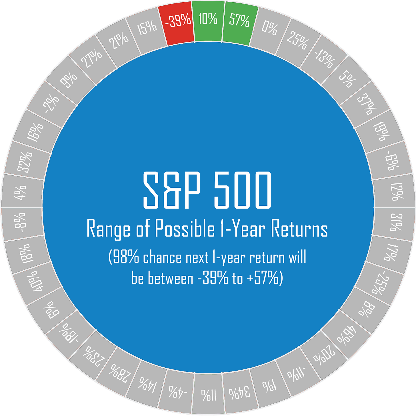
This Wheel shows the range of returns for a 1-year investment in the stock market (based on nearly 100 years of data from the S&P 500 Index), which we’ve divided into 38 percentiles and distributed around the Wheel. Green spaces represent percent increases. Red spaces represent percent decreases.
Due to the way the Wheel is constructed, it goes from the highest value on the Wheel (the 99th percentile) to the lowest (the 1st percentile) meaning there’s a 98% chance—based on an evaluation of historical returns—that the return for the stock market over the next year will fall within this range.
All returns are equally likely.
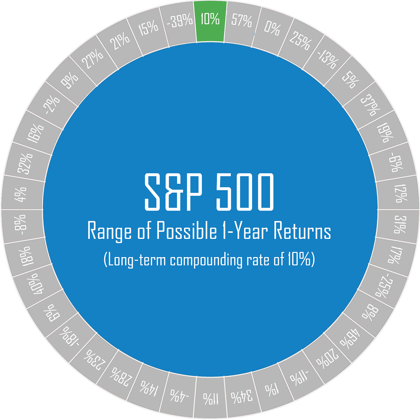
There are several things to notice when looking at the Wheel. The number at the very top is the long-term compounding rate. This is very important.
Compounding is the secret to investing, the nearly magical way that small amounts of money—via exponential growth—can grow to surprisingly large amounts of money over time.
The compounding rate on your portfolio is one of the most important numbers you should be looking at.
For the stock market (S&P 500) this number is 10%. You can become very wealthy if you can grow your money at 10%. This is why Stocks are, by far, the best major asset class for long-term investors.
Range of Returns
The numbers next to the 10% are the low (-39%) and high (+57%) returns on the Wheel, meaning these are the worst and best returns you can expect for Stocks over any given year. (There’s a 1% chance the return could be above or below these values and still be something we’ve experienced before.)
The goal of the Wheel is to provide a visual range of what to expect 98% of the time.
Negative Returns
Investors naturally worry about the stock market going down over the next year. But, do they have any idea of how likely this is?
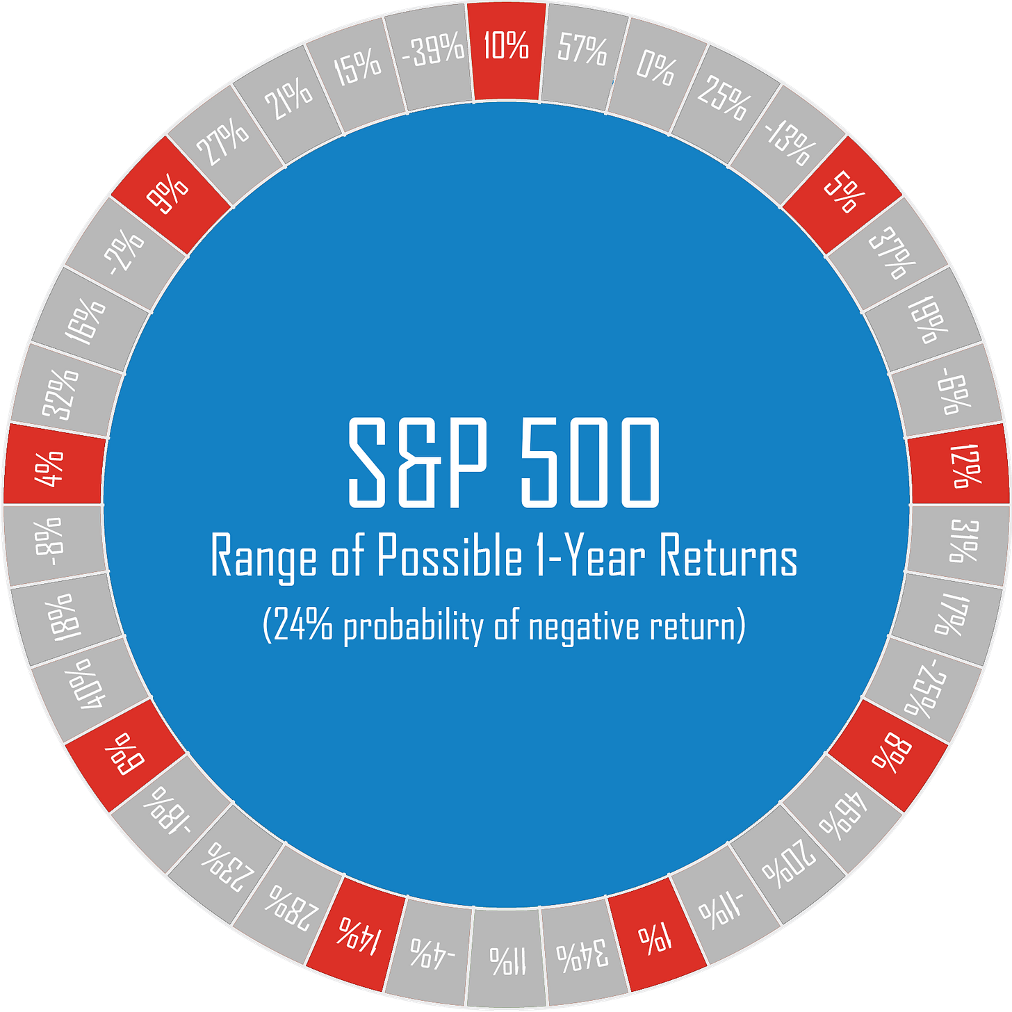
The red squares on the Wheel answer that question. First, by the visual comparison between red and green and then by the fact we give them the actual probability as a number.
Positive Returns
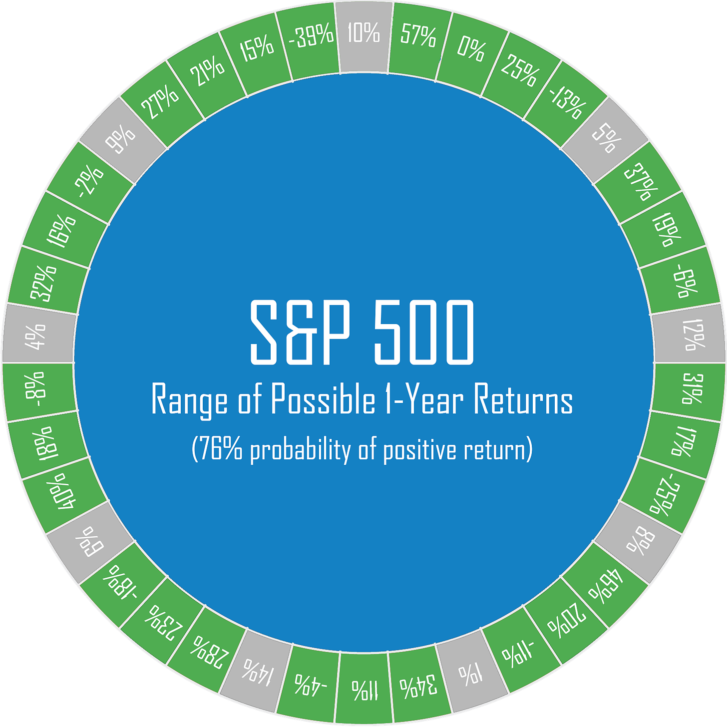
The fact that there are far more green spaces than red spaces helps make the point that the odds are overwhelmingly in your favor. When you’re investing, you’re The House. This is why investing is the opposite of gambling.
Summary
Most people (even many “experts”) lack a full understanding of what to expect from investments in different assets or over different time periods for the same asset.
Can you guess, for example, how many red spaces there would be if we created a 20-year Stock Wheel?
We may show it to you in a later post, but the answer is zero.
These Wheels help you visualize the range of plausible returns and the likelihood of negative returns for any given asset and time period.
In the same way learning the method to viewing a painting can help you understand it more fully, these Wheels can help deepen your understanding of what to expect when investing.
In turn, that increases your understanding of and confidence in the process.
Which brings us back to our stated goal of these posts: More Money; Less Stress.
Best regards,
Stuart & Sharon

